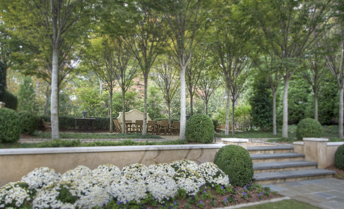
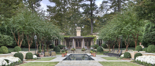
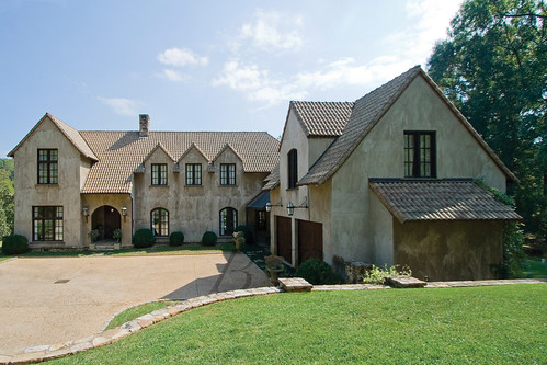
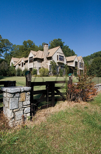
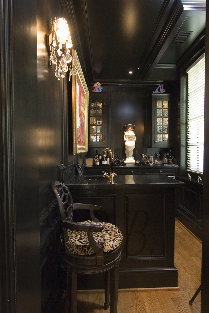
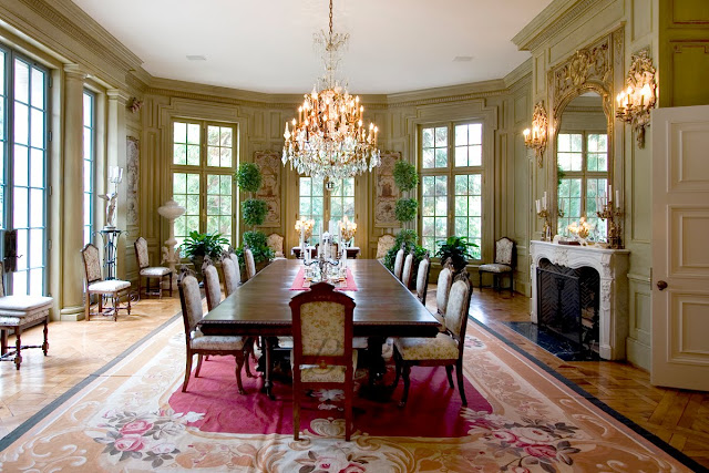
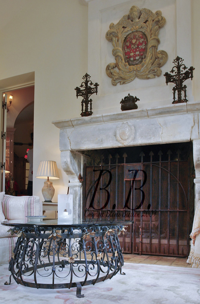
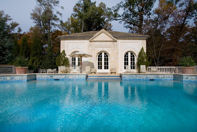
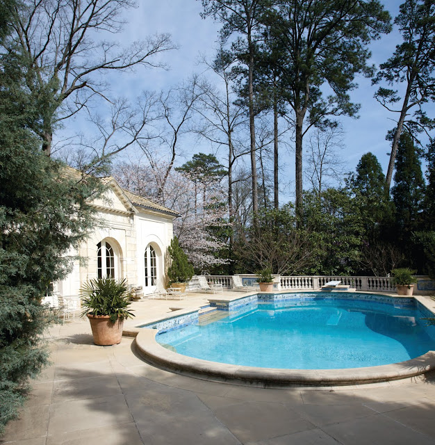
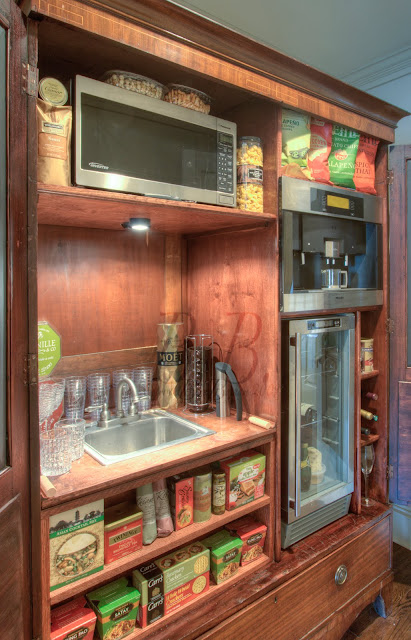
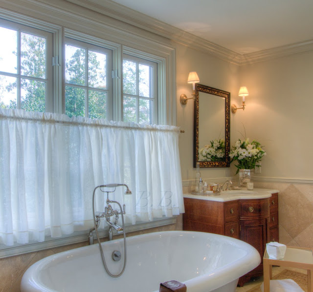
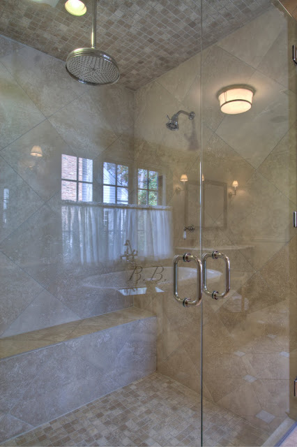
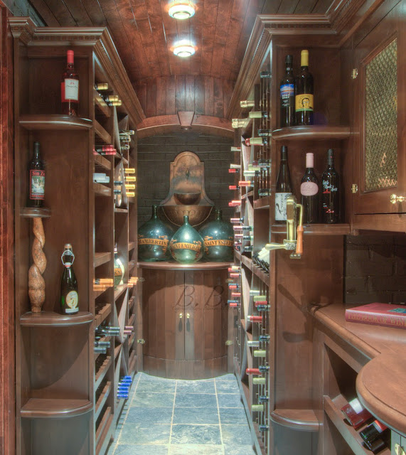
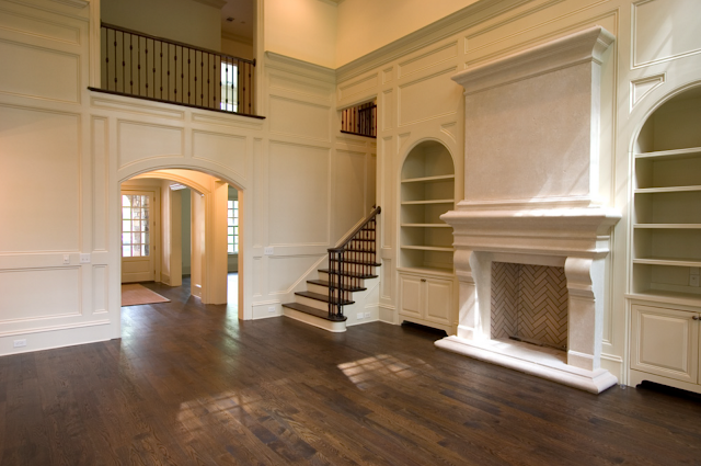
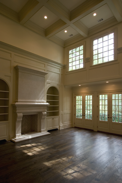
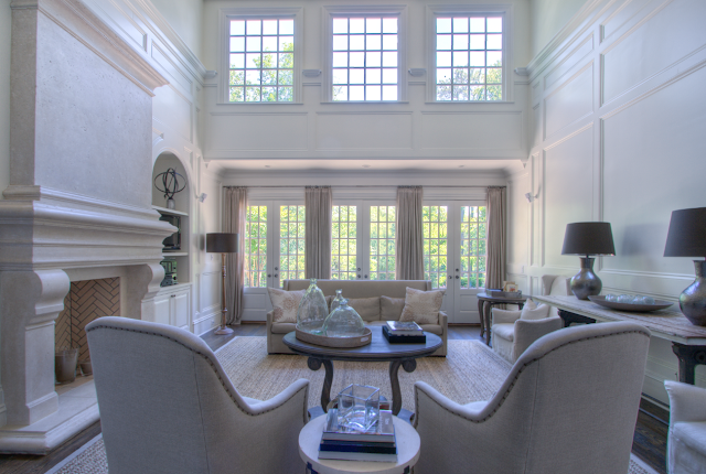
"Shutze Award" Winner 2008 - 981 Davis Drive

Photo by Rod Collins

Every year the Institute of Classical Architecture & Classical America hosts The Shutze Awards. They are named for Philip Trammell Shutze, "the Atlanta architect whose work is revered internationally as one of the twentieth century's most devoted Classicists. The award will recognize similar individuals who are contributing to the creation of twenty-first century classical and traditional architecture."

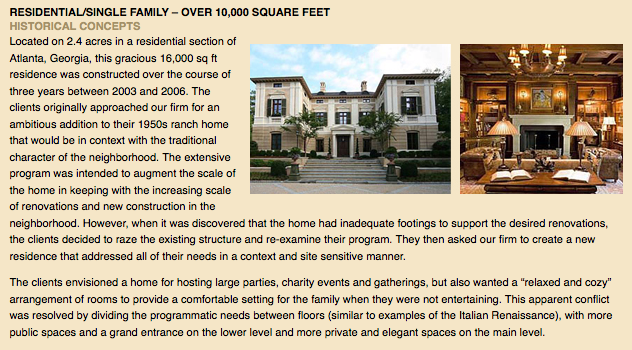
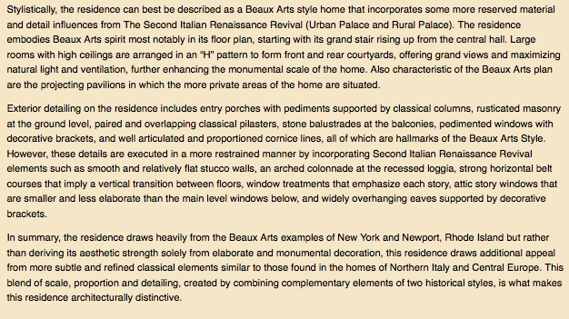
Glennis Beacham just listed the 2008 Shutze Award winner for Residential/Single Family - Over 10,000 Square Feet

Screen shot 2010-01-05 at 5.00.17 PM
Screen shot 2010-01-05 at 5.00.33 PM

The Home:

Slide03
Photo by Rod Collins

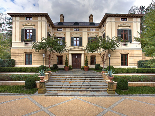
981 Davis Drive

Architect: Historical Concepts

Style: Beaux Arts

Completed: 2006

Bedrooms: 7

Bathrooms: 7 Full, 3 Half

Acres: +/- 2.4

Guest House

All of the following photos were taken by Blayne Beacham, Copyright 2010

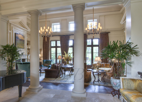
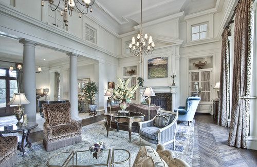
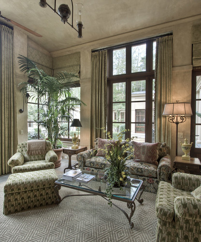
Upper Living room

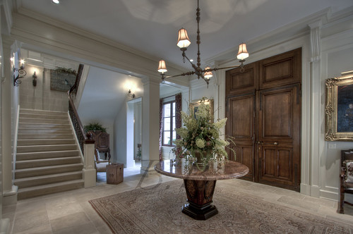
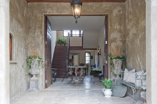
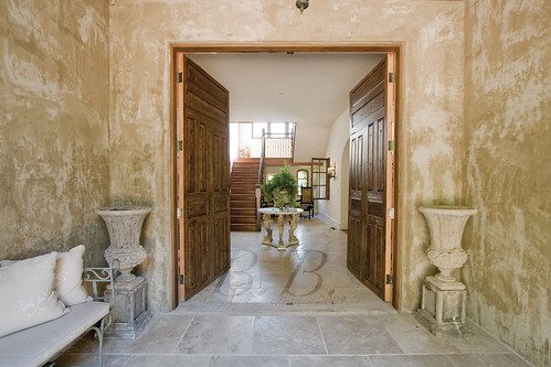
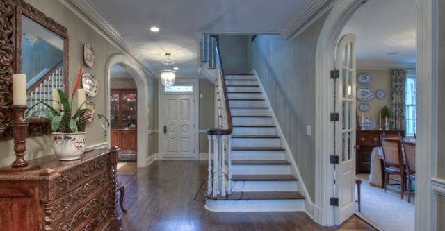
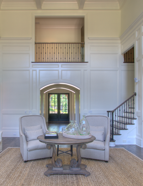
View walking into foyer

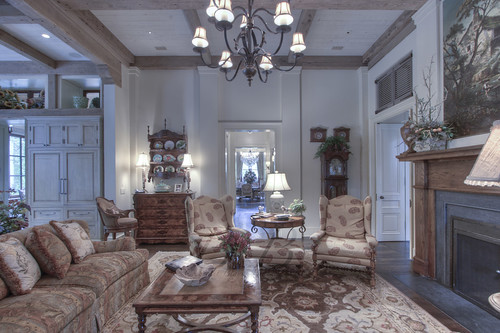
Living rm

Main level living room with view of foyer

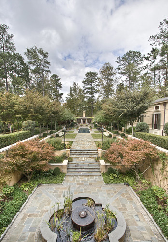
Out to Pool House

View out from the living room over the back of the home

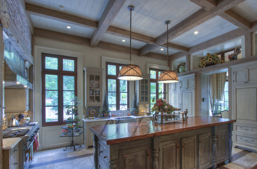
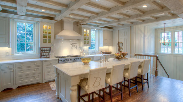
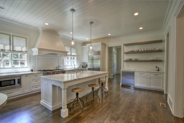
Kitchen

Kitchen

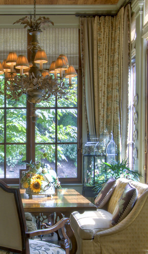
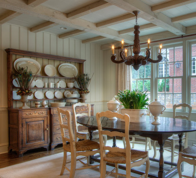
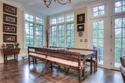
Breakfast room

Breakfast room detail

Keeping rm

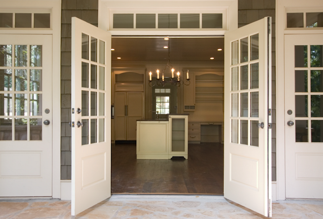
Keeping room (Dining room is visible through doors)

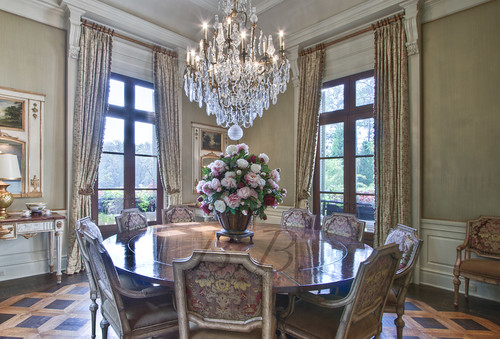
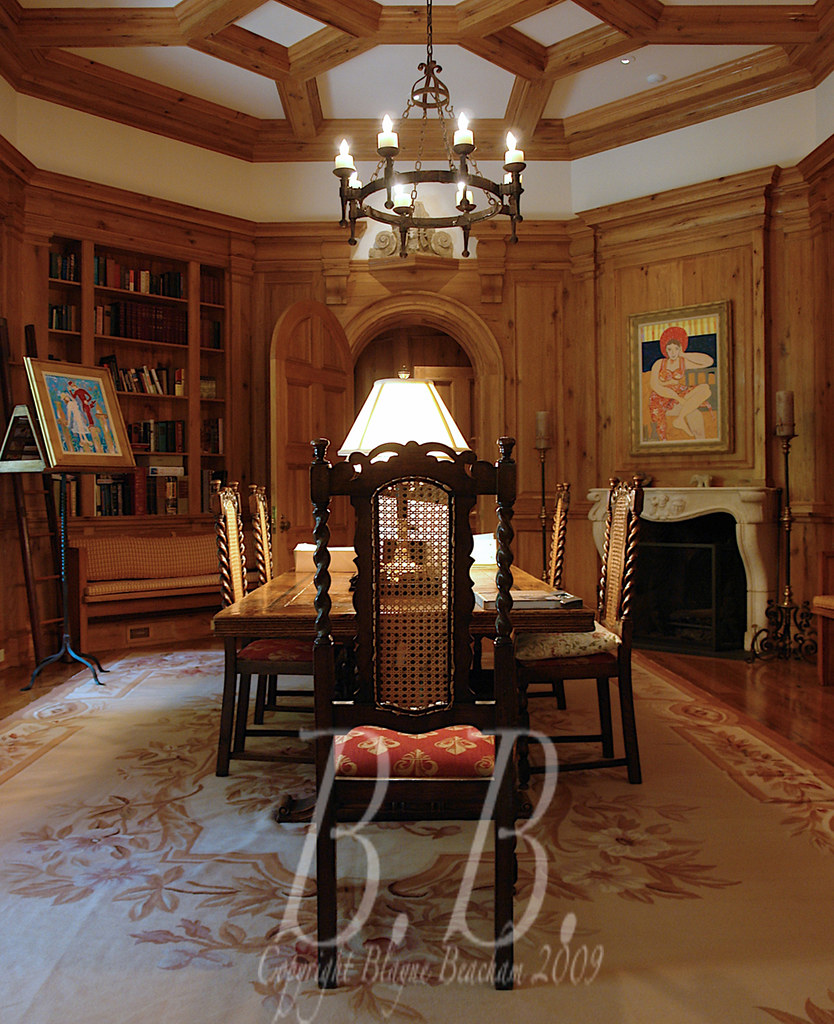
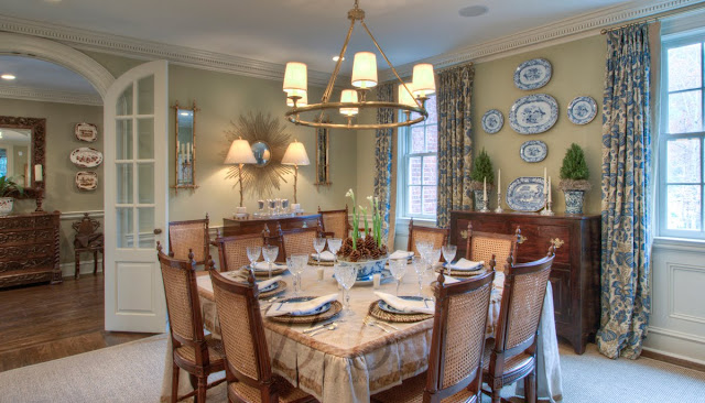
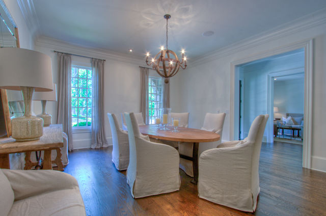
Dining rm
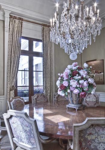
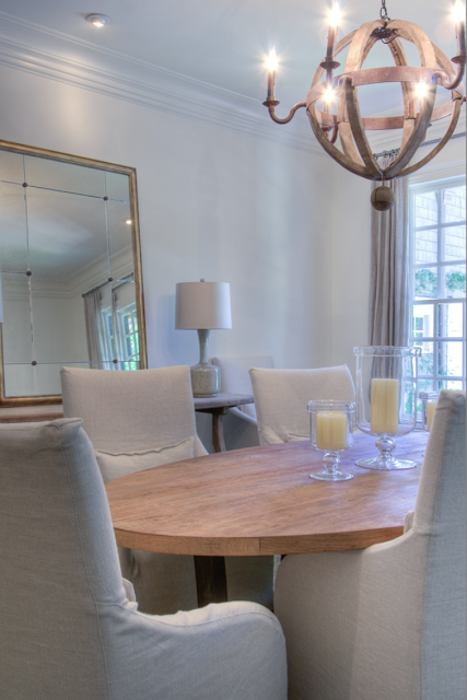
Dining rm detail

Dining room

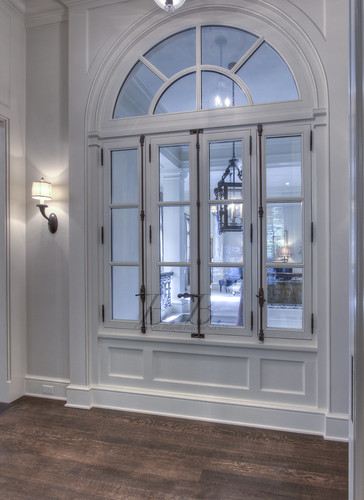
Arched windows

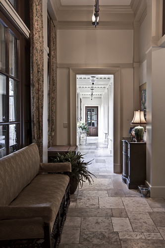
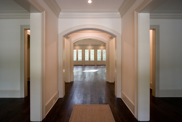
View from kitchen hallway into foyer

Down Back Hall

Back Hall (one of the screened porches to the left)

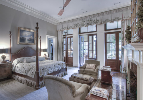
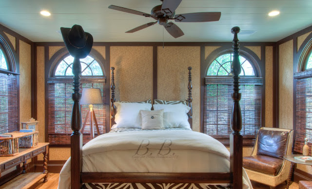
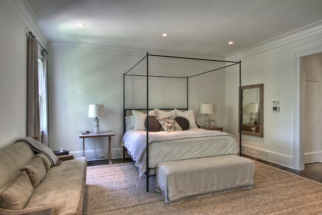
Master Bedroom

Master bedroom suite

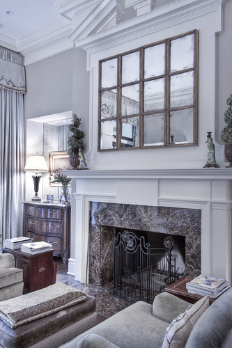
Master Fireplace

Master fireplace

Master Sitting Area

Master sitting area

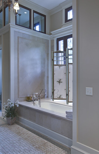
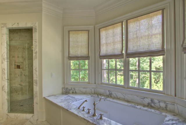
Master Bath

Master Bath

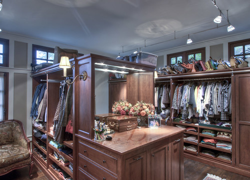
Master Closet

Master Closet

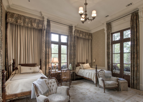
Secondary Bedroom

Secondary Bedroom

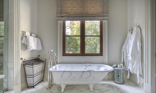
Secondary bath

Secondary Bath

Lower Foyer
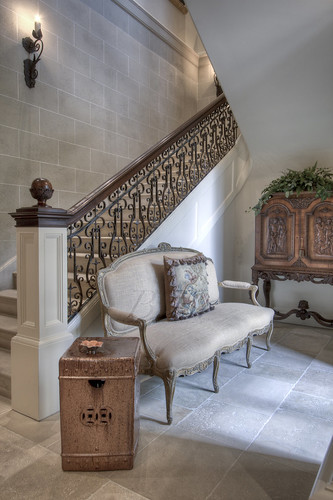
Stairs

Terrace Level Foyer

Terrace Family room

Terrace Level Living Room

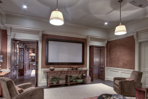
Theater

Terrace Level Theater

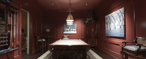
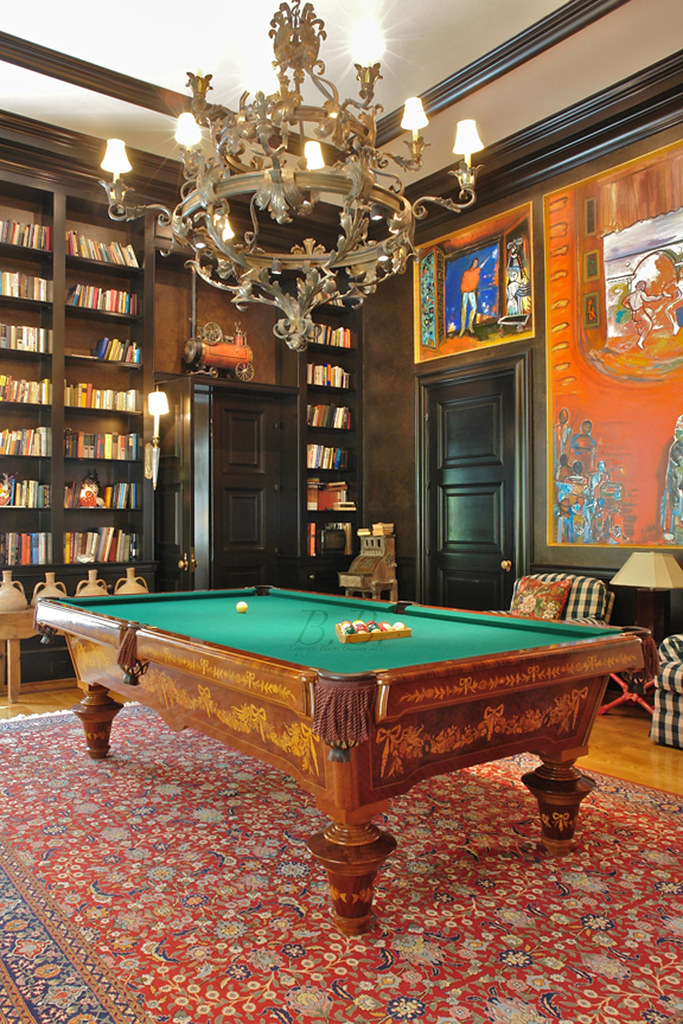
Pool Table

Billiards Area

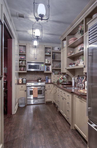
Terrace Kitchen

Terrace Level Kitchen

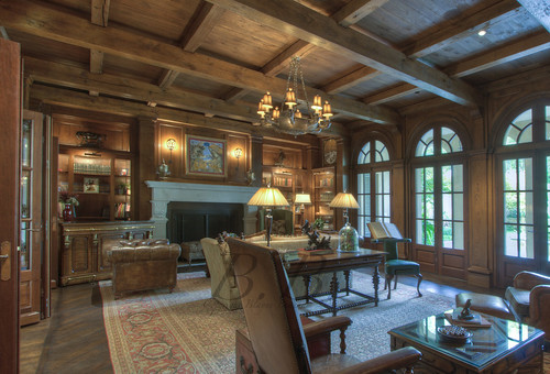
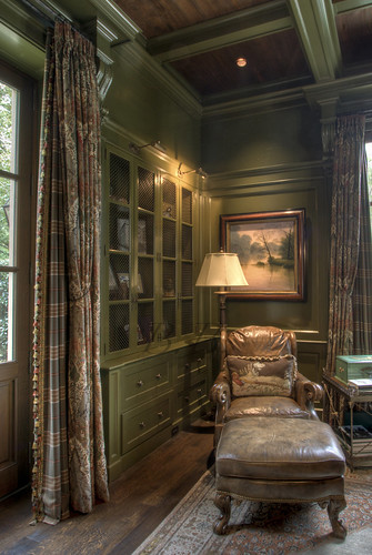
Mans office

Terrace office

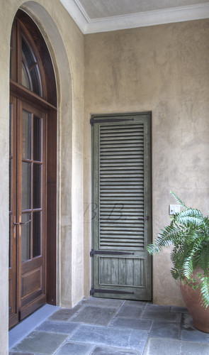
Green Door

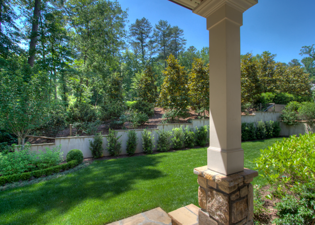
Terrace level back patio

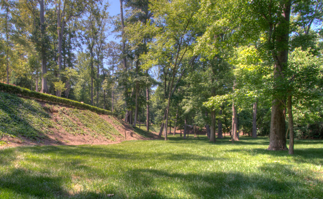
Table in Clearing

Backyard eating area

Guest House

Guest House

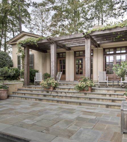
Pool House Porch

Guest House Porch

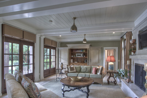
Guest House Living Room

Guest House Living Room

That's it for the tour! What do you think??

Happy 2010 everybody! I hope it's a great one.

Thanks to all my followers for making 2009 a great year to start a blog. I hope it gets even better.

SOLD HOMES on Mondays ! Peter Block + King Developers + Meridy King = AMAZING!

505 Brookfield Drive, cover of the Summer 2009 issue of "The Beacham Series" has been SOLD by Beacham & Company agent Linda Williams!


Architect: Peter Block Built by King Developers. Built in 2000 Interior Design by Meridy King

Bedrooms: 4 Bathrooms: 4 Full, 1 Half

Photography by Blayne Beacham Copyright 2009

"The perfect collaboration between husband and wife. They fulfilled their dream of constructing their own "European Castle ..." - The Beacham Series Summer 2009

505 Front

This home combines re-purposed materials and antiques

505 back of house

This home sits on more that 1.5 acres backing up to a horse pasture. The steps leading up to the covered porch at the rear of the home are made from Scottish sidewalks!

505 Detail shot

This shot showcases the veranda at the front of the home. In the background you can see the front doors, which were once pavilion doors on an old Spanish stable. The doors offer a short human passage, and they still open all the way to the top. In their original use this feature was to ensure the horses could make it into the barn!

505 Detail shot 2

I spoke to Woody King of King Developers, and he told me the exterior of this home is made of hard coat stucco with "rough trial" finishing. The roof is constructed using imported clay tile from a village in Italy.

505 Detai 4-2

Here is a closer view of the stucco. Beautiful, isn't it?

Another Entryway-2

Veranda into the foyer. The front doors offer a short human passage, and they still open all the way to the top. In their original use this feature was to ensure the horses could make it into the barn!

505 Entryway

This shot is from the first time I went to the home. You can tell the difference between a magazine shoot and a regular shoot... I think you can see the doors better in this photo.

505 foyer 3

Here is a view of the foyer of the home. The floors here as well as the veranda are made with 24-ince honed, unfilled limestone

505 Foyer 4

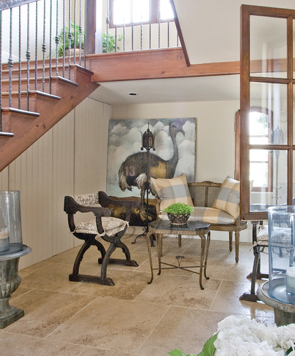
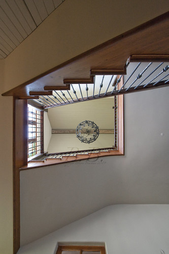
This is a closer shot of the little area under the stairs. If you look up you see this,

505 Brookview Up Stairs

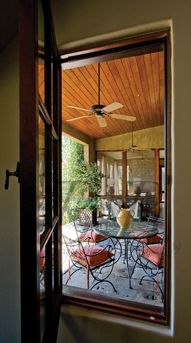
If you look out the window on the right you see this...

505 Brookview porch-2

Yorkstone from an English factory is for the floor of the back patio.

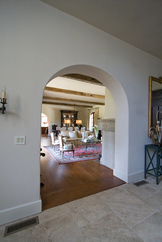
505 Arch

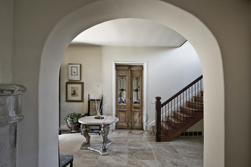
View from the foyer into the living room... Here is the opposite view...

505 Brookfield foyer-2

Can you believe how thick the walls are?

505 Brookview floorplan

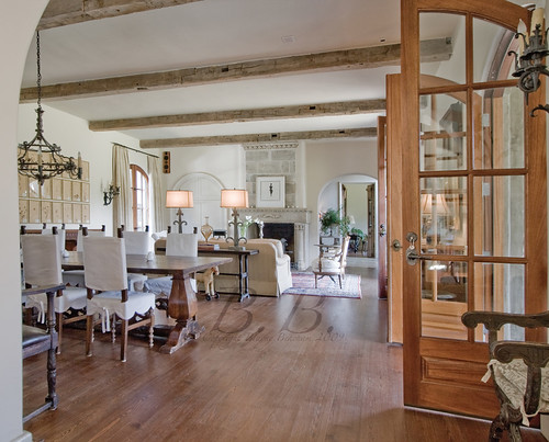
This was the inspiration for the cover photo. If you go back to the top you can see how the room was styled for the shoot with the help of interior designer Anne Williams. You can see why it was chosen! 2 sets of arched wooden doors line the back of the home. (For those of you who are interested, these remind me very much of the doors and windows Keith Summerour uses, and that I wrote about in this post.)

505 Brookview Living Room
505 Living room detail-2
505 living room

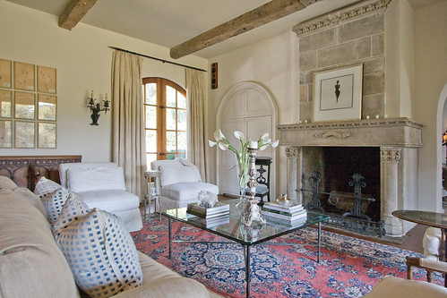
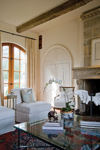
Again, these pictures were taken at two different times, but both make the room look equally beautiful! The ceiling beams came from a barn in Pennsylvania, and the stone on the fireplace is over 200 years old!

So, I hope you have enjoyed the second week of SOLD HOMES on Mondays! If you missed last week's post, check it out here!

Until Next time- BB

SOLD HOMES on Mondays! 3650 Tuxedo Road, Descante

Introducing SOLD HOMES on Mondays, where I will be featuring some of Beacham & Company's best SOLD homes every Monday. First up, 3650 Tuxedo Road


House Name: Descante: A 15th century Italian word (descant); the highest harmony to the main melody of life

Sold in 2009 by Glennis Beacham

Architects: Norman Askins and Yong Pak Builder: Bonner Construction

7 Bedrooms 10 Full, 3 Half Baths More than 4 gated acres Guest House Pool House Caretaker's Residence Unless otherwise noted, all photography by Blayne Beacham, Copyright 2009

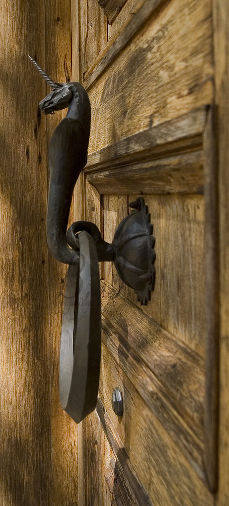
Tux Doornob - BB

This is one of my favorite houses we have ever sold! Every inch of the home was full on imagination and wonder. I will share some of my favorite parts.


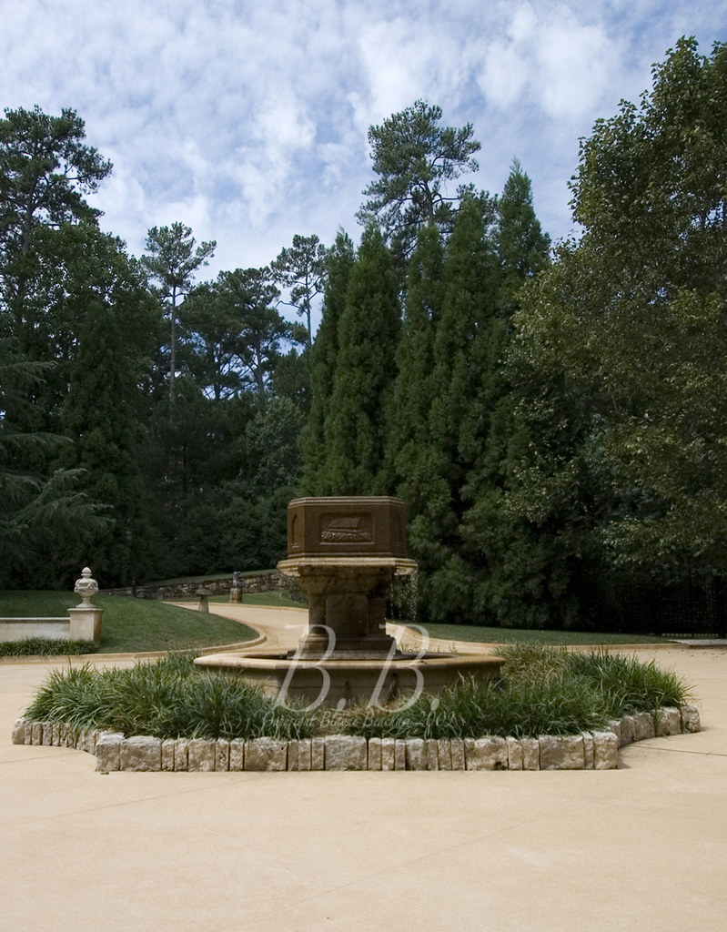
This is the front of the home, which features a motor court centered around a 16th century baptismal fountain.

Descante Fountain

Here is a better view of the sides of the fountain, which were carved with scenes telling stories.

19Millhall (1)

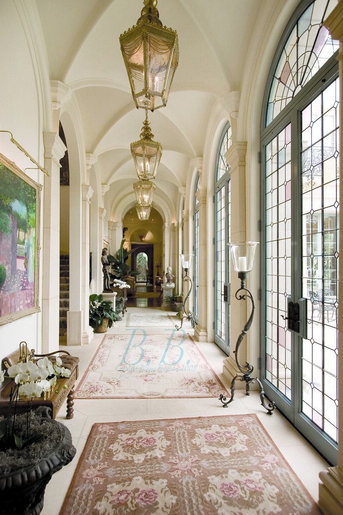
This is the main hallway of the home with cloister vaulted ceilings. The hallway is lined by custom glass doors designed to mimic the throwing of confetti!

Tux Library 1 - bb

This beautiful office hides a paramour's escape!

19 Mill Lib


I called this "The Harry Potter Library." There is a secret passage that runs between here and the Living room. The 14-foot Limestone mantel on the left hand side is one of two in the home that came from Cambridge. The enclave overlooks a private fountain.

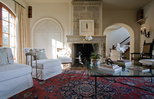
This is the living room, and the room to which the secret passage leads. This room opens to a cast stone and Limestone courtyard designed as a large chess board at the back of the home.

Tux Pool Table - BB

The Billiards room across from the living room was painted black and featured murals on the wall by Carlos Nadal.

Bar

This bar was just off the Billiards room.


Here is the dining room. It featured Corbels from the Syon Lodge in England, and it also opened to the chess board back patio.

19 Mill Sun Room

This is the other mantel from Cambridge. It was in the sun room just off the kitchen.


I actually have this picture hanging in my office I love it so much. It is a porte-cochere from Barcelona running between the garage and the motor court. It features a Russian family shield on the wall.

This shows the pool, which is walled with illustrations depicting the history of the world.


Photo by Rod Collins

Here is a better view of the pool house. part of the door came from a winery in Burgundy.


Photo from the pool looking back at the house.

I hope you enjoyed the first SOLD HOMES on Mondays! What do you think about this house?

The Owners of Tennille and Company Are Selling Their Home!

Check out this amazing new listing from the owners of Tennille and Company!  Listed by Glennis Beacham Architect: (Renovation by)Tim Adams of TS Adams Studio Decorator: Cassandra Tennille Landscape Design: Graham Pittman

This amazing home in Buckhead was originally built in the 1930s and then renovated with exacting historical preservation by the current owners in 2007-08.

6 Bedrooms 7 Bull, 2 Half Baths

Guest House with 1 Bedroom, 1 Bath

Unless otherwise specified, all photography by Blayne Beacham, Copyright 2009

Photo by Michael Welling


  Photo by Michael Welling
 
  
Photo By Michael Welling
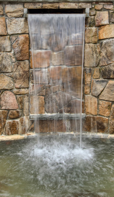
This pool features an underwater sound system, the likes of which can be found in 4 star resorts!
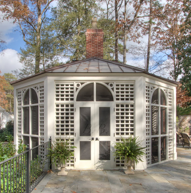
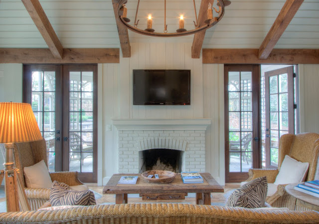
Guest House


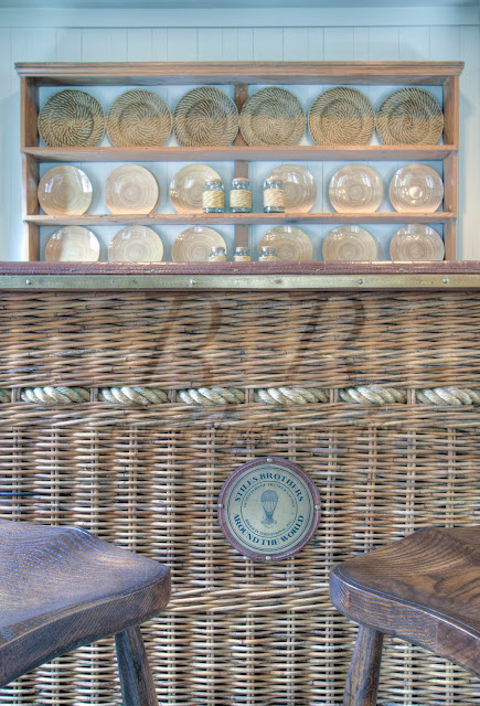
 Just a note:  This bar is made from half of a hot air balloon basket!!

Isn't this am amazing house??

So, on a different note, I have been talking about color a lot on this blog, and I want to know....  What do you guys think about the colors in this home?

Harrison Design Associates: "Return to Color"

My good friend who writes Architecture Tourist noted in one of my earlier postings that he liked the house but wished it had some color. The author of Things That Inspire commented that the new issue of Atlanta Homes and Lifestyles was called, "return to color." Well, if you want it, we've got it :)

Check out this amazing home designed by Harrison Design Associates and listed with Glennis Beacham.  Notice the homeowner's bold and unique use of color.  What a great home!

All Photos By Blayne Beacham Copyright 2009

 
This staircase is so classic and beautiful.
Look at the gray with the bright red curtains!  This is such a happy room.
I love this room because so many elements are classic Harrison Design, like the beams, the windows and the fireplace, but then the bold blue is able to completely transform the room into something so unique and happy.
The island and the grand scale of the room are so unique.  The island does not overcrowd the room, but it's perfect for added cooking space.
Breakfast Area.  Don't you love those windows.  There is a set of French doors to the right that open to a back patio.
Grand Master Suite.  I covet this furniture!  The desk in the "middle" of the room is fabulous.  I took so many pictures of it just to remember what it looks like.
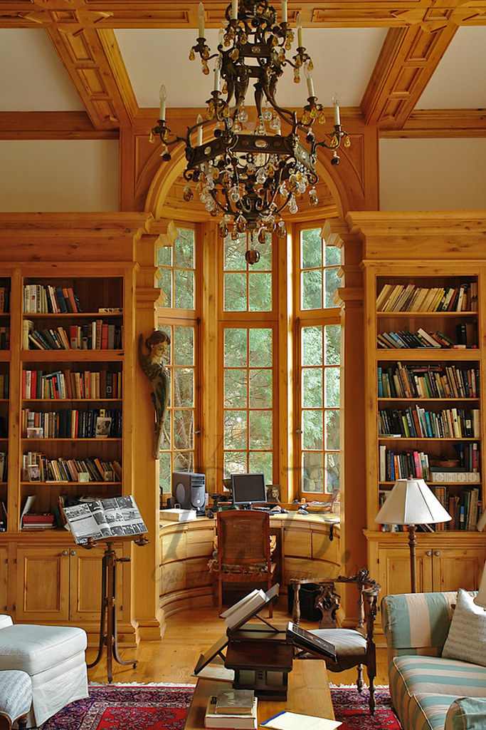
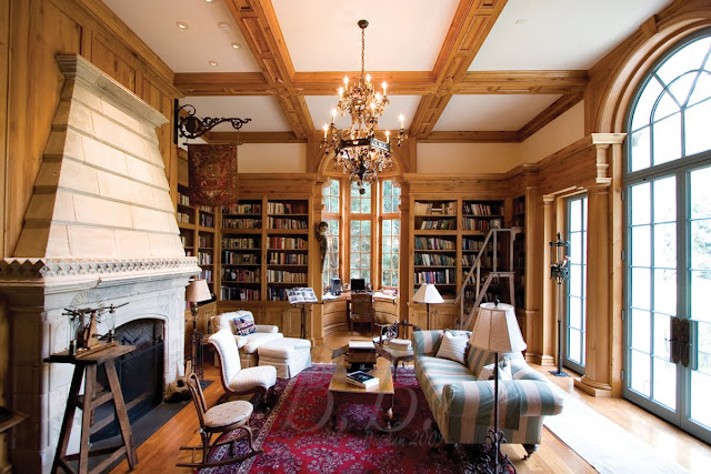
Warm library just down from the master suite.
This is the terrace level dining room.
 
Terrace level guest suite.
So, isn't this a great house for color?  What do you think?

1224 Peachtree Battle: Before and After!

One of the perks of my job is when Beacham&Company, REALTORS get to sell a house for a second time!  I love getting to see how a house changes when the owners change.  We recently listed 1224 Peachtree Battle for the second time.  The first time Glennis Beacham listed this home it had just been completed.  It was an amazing house then.  All the amenities, full of light, and an amazing approach.  Needless to say, it was not on the market long.  Well, as luck would have it, we get to list it again!  It was hard to believe it was the same house.  The contrast in these too pictures is not only a testament to the power of excellent interior design, but it is also concrete evidence of how much I have learned as a photographer in the last three years.  Both are amazing. Older images: Blayne Beacham Copyright 2007 Newer Images: Blayne Beacham Copyright 2009

House as of Summer 2009

Entry Foyer as of 2007
 Here is a 2007 view of the above shot from a slightly different angle.  This shot shows the amazing construction of the home.  I like the brick pattern in the fireplace as well as the arched built-ins and the marble mantel.  This is also a home where you can walk in the front door and see out to the backyard, which makes it so light and open.
 2007 View of the room from the opposite direction.  I love the wall of French doors along the back.  They open to a stone patio.
This is actually a 2-story great room.  The Coffered ceilings and dark wood floors are great accents and make this large room feel warm.
Views of the room today.  Can you believe it?
Here are a few detail shots of this room.
I love these Coffered walls.
These are so beautiful
I don't have before and after pictures for all the rooms in the house, but here are a few from how it looks now.  The rooms are so fresh!

Formal Living Room

Don't you love the feel of this dining room?
I love the light fixture above the table, the chair covers and the mirror.

Keeping Room

Below is the only picture I have of the kitchen from 2007.....

I know you can't tell much from that, but here is how it looks today!

I love the the built-ins have been removed.  The dish display on the right side is so simple and chic, plus you get an extra dishwasher!  I am not sure exactly what the island looked like before, but you can tell it has been changed and is much more open.  The lights above the island were also a great improvement, as was the switch to the stainless steel refrigerator.

Here are a few detail shots from the current house...

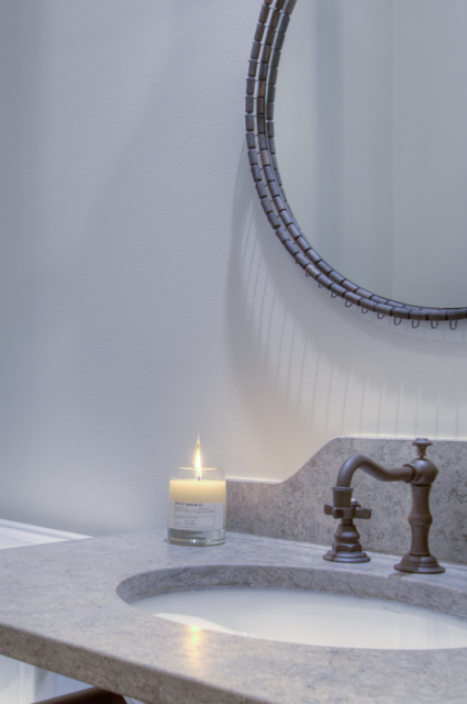
This is a picture of the half bath on the main level.  I love the edges of that mirror!
I believe this is in the foyer ....
Now, on to the master!
I can't find a shot of the original master bedroom, but here is how it looks now.
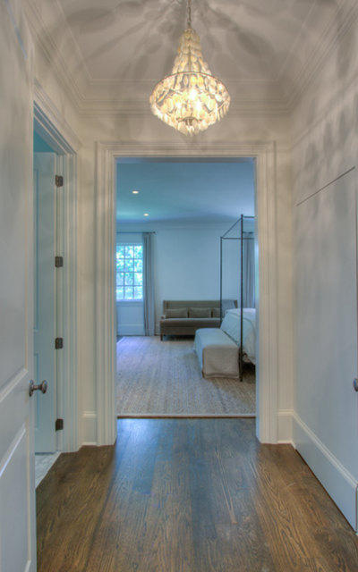
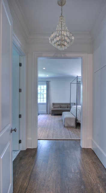
Hallway into the master with the light on....
I couldn't decide which photo to use because they have such different feels....  So I showed both.
I loved this light fixture so much a took a photo of it looking up.  I think it is made from shells?
On to the Bedroom...
Beautiful, right?
Detail shot of the curtain and sofa
Sitting are between the masterbedroom and the master bath...
Master Bath ...
And finally, this is a view of the front yard.
Can you believe it?  This is like a soccer field!  What an amazing yard for children.
And this is the side yard.  Amazing...
So, can you believe the difference?  What do you think?
To learn more about this site, please see Glennis Beacham's website for the listing.